Showing posts with label Art and Design. Show all posts

Sunday, March 25, 2007

เรียนแบบธรรมชาติ

2007-03-25


Art is primarily a question of form, not of content.
Paul Rand


ทุกๆ ปีสมาคมสถาปนิกฯ จะจัดงานแสดงสินค้า(พวกวัสดุก่อสร้าง)และนิทรรศการของบริษัทสถาปนิกต่างๆ ซึ่งบริษัทที่เราทำงานอยู่ต้องออกแบบบูธนิทรรศการไปจัดแสดงด้วย(เหมือนทุกๆปี)

ปีนี้มีชื่อธีมในการจัดงานว่า ต้นกล้าสถาปัตย์-Leap to the Future

เมื่ออาทิตย์เราได้รับมอบหมายจากพี่ที่รับผิดชอบในเรื่องนี้อยู่ ให้ลองออกแบบบูธของบริษัทในปีนี้ดูหน่อย (ซึ่งเราไม่ค่อยอยากทำเท่าไหร่หรอกนะ เพราะปีที่แล้วเราก็เป็นคนออกแบบแต่ถูกเปลี่ยนแบบจนไม่เหลือเค้าแนวความคิดเดิมของเราเลย :P จากนิทรรศการที่เน้นเรื่อง System ของการทำงานของส่วนต่างๆ ภายในบริษัท ว่าแต่ละคน(หน่วยย่อยๆ) สัมพันธ์กับคนอื่นๆยังไง(แสดงให้เห็นความเชื่อมโยงกันในแต่ละตำแหน่ง) เป็นนิทรรศการที่แสดงให้เห็นโครงข่ายในการทำงาน-กลายเป็นนิทรรศการคล้ายเกมส์โชว์เปิดแผ่นป้ายเฉยๆอ่ะ ซึ่งเราไม่ค่อยชอบมันเท่าไหร่ :P)

แต่ด้วยตำแหน่งที่ต้องรับผิดชอบอยู่ในโปรเจคนี้--Head Creater :P ทำให้เราปฏิเสธที่จะรับงานนี้ไม่ได้(ทำก็ทำว่ะ-คิดในใจนะ ^_^) แต่เราก็จะทำเต็มที่ตามแบบที่เราคิดอ่ะนะ (พอออกแบบเสร็จเราต้องนำแบบของเราไปเสนอ design committee ของบริษัทอีกที--ตรงนี้แหละที่เป็นตัวชี้ขาด ว่าจะไปในทิศทางไหน)

เงื่อนไขในการออกแบบที่เราได้จากผู้จัดงานก็คือ
1.ขนาดของพื้นที่นิทรรศการในปีนี้เท่ากับ 3x3 เมตร (เล็กกว่าปีที่แล้วเท่าตัว)
2.สีที่ใช้ในนิทรรศการต้องเป็นสี CMYK เท่านั้น


ภาพโมเดลจำลองของบูธที่ผมออกแบบ


รายละเอียดแสดงแนวความคิดคร่าวๆ ในการทำงาน (ส่วนภาษาญี่ปุ่นน่ะ ใส่ลงไปเพราะความกระแดะส่วนตัว ^_^)


ภาพถ่ายจากโมเดลแสดงบรรยากาศภายในเทียบกับสัดส่วนคนดู


แบบที่เราคิดไอเดียก็ไม่ได้ซับซ้อนอะไร ด้วยชื่องานในปีนี้ที่คล้ายกับ "การเจริญเติบโต"--Leap to the Future เราก็เลยนึกถึงคณิตศาสตร์แบบ Fractal ที่เชื่อว่าเป็นระบบการเติบโตที่มีอยู่ในธรรมชาติ เอามาเป็นจุดเริ่มต้นในการทำงานออกแบบ กราฟฟิกที่ได้จึงเป็นกราฟฟิกที่เจริญงอกงามเลียนแบบการเจริญงอกงามที่มีอยู่ในธรรมชาติ

แม้รูปร่างหน้าตาของมันจะไม่ดูเป็นธรรมชาติเลยก็ตาม เฮอๆ ^_^

พอทำเสร็จมีรุ่นพี่คนนึงมายืนดู แล้วถามเราเรื่องไอเดียหรือที่มาที่ไปในการออกแบบ
เราก็เล่าให้เขาฟังไปตามเรื่องตามราว บลาๆๆๆ (ดังที่ได้เขียนเอาไว้ด้านบน ^_^)
พี่คนนั้นเงียบไป ไม่ยอมพูดอะไรแล้วก็เดินกลับไปทำงานต่อที่โต๊ะ

สักพักพี่เขาก็เดินเข้ามาคุยด้วยใหม่
“จี้ไอเดียดีมากว่ะที่เอ็งคิด แต่พี่ว่ามันยังดูไม่เป็นไทย พี่ว่าถ้าใส่อะไรที่ดูเป็นไทยๆ เข้าไปจะเจ๋งเลย”

เมื่อได้ยินแบบนั้นผมแทบจะพูดอะไรไม่ออก :P

เหมือนพี่เขาเข้าใจไปคนละเรื่องเลย

ก็ในเมื่อกราฟฟิกมันเลียนแบบระบบในการเจริญเติบโตมาจากธรรมชาติแล้วล่ะก็
มันคงไม่มีไทยมีฝรั่งหรอก

เพราะธรรมชาติมันไม่ได้เกี่ยวอะไรเลยกับความเป็นชาติ(นิยม) ไม่ว่าชาติไหนก็ตาม :P
ไม่เชื่อลองไปถามต้นไม้ ภูเขา หรือ ทะเลดูก็ได้ ว่า เฮ้ยเอ็งถือสัญชาติอะไรอยู่ว่ะ
รับรองได้ว่ามันไม่ตอบเราหรอก-มันจะเงียบๆ ไม่ยอมพูดอะไรเลยซักแอะ
เพราะคำถามแบบนี้

มีแต่มนุษย์เท่านั้นแหละที่คิดจะถามกัน ^_^

+:+:+:+:+:+:+:+:+:+:+:+:+:+:+:+:+:+:+:+:+:+:+:+:+:+:+:+:+:+:+:+:+:+
Books bought:
-ปรัชญาวิทยาศาสตร์โดยสังเขป--ซาเมียร์ โอคาชา แปลโดย จุไรรัตน์ จันทร์ธำรง
-ไปนอก(ฉบับสมบูรณ์)--สอ เสถบุตร
-เศรษฐกิจ การเมืองไทย สมัยกรุงเทพฯ--ผาสุก พงษ์ไพจิตร และ คริส เบเคอร์
-Volume 10 : Agitation--2006#4

Books read:
-In the Bubble : Designing in a complex world--John Thackara
-ปรัชญาวิทยาศาสตร์โดยสังเขป--ซาเมียร์ โอคาชา แปลโดย จุไรรัตน์ จันทร์ธำรง
-ไปนอก(ฉบับสมบูรณ์)--สอ เสถบุตร
-Volume 10 : Agitation--2006#4

Monday, March 19, 2007

Data Spaces

2007-03-19

"We are born as new hard drives, and culture formats us"
Douglas Coupland, Microserfs


เทด รอลล์ แห่ง slate.com เคยเขียนเอาไว้ว่า Jimmy Corrigan ของ คริส แวร์ คือ Ulysses(นิยายที่เขียนโดยเจมส์ จอยซ์) ในโลกกราฟิกโนเวล(ข้อมูลนี้ก็มาจากหนังสือ Jimmy Corrigan นั่นแหละ)

เรา(ในที่นี้หมายถึงผม+คนอื่นๆ ที่ตอนนี้กำลังพยักหน้าเห็นด้วยอยู่ ^_^)ก็อาจจะพูดได้เหมือนกันว่ามิวสิควิดีโอเพลง Remind Me ของ Royksopp(ที่อยู่ด้านบนน่ะ) คือ Ulysses ในยุคข้อมูลข่าวสารนั่นเอง (หรือที่ภาษาอังกฤษเรียกว่า Information Age-ยุคที่มนุษย์มีข้อมูลมากมาย(ท่วมหัว)แต่ก็อาจจะเอาตัวไม่รอด-เหมือนเช่นยุคอื่นๆ เฮอๆ :P)

ต้องขอสารภาพว่าตอนนี้กำลังชอบมิวสิคเพลงนี้--แบบให้หมดใจเลย 55 ^_^
เออจะว่าไปมิวสิคนี้ก็ทำให้เรานึกถึงกราฟฟิก โนเวล ของ คริส แวร์ด้วยเหมือนกัน

ปล.-อันนี้สำหรับคนที่อยากตามไปลองฟังเพลงอื่นๆของ Royksopp
http://www.royksopp.com/
+:+:+:+:+:+:+:+:+:+:+:+:+:+:+:+:+:+:+:+:+:+:+:+:+:+:+:+:+:+:+:+:+:+


อันนี้เป็นตัวอย่างกราฟฟิก โนเวล เรื่อง Jimmy Corrigan : The smartest kid on earth ของ chris Ware

+:+:+:+:+:+:+:+:+:+:+:+:+:+:+:+:+:+:+:+:+:+:+:+:+:+:+:+:+:+:+:+:+:+

Q: ในมิวสิควิดีโอเพลงนี้มี Diagram และแผมภูมิต่างๆ ทั้งหมดกี่ชิ้น?
A : (ไม่มีคำเฉลยหรอกนะ เพราะขี้เกียจนับ แต่ดูแบบผ่านๆก็รู้ว่าเยอะโคตรๆ เฮอๆ :P)

+:+:+:+:+:+:+:+:+:+:+:+:+:+:+:+:+:+:+:+:+:+:+:+:+:+:+:+:+:+:+:+:+:+
Books bought:
-Beware Wet Paint--Alan Fletcher
-Designing For A Digital World--Edited by Neil Leach

Book read:
-From Lascaux to Blooklyn--Paul Rand

Tuesday, March 13, 2007

ลังไม้ ก็คือ ลังไม้

The Crate
2007-03-13


The Crate ลังไม้ที่ออกแบบโดย Jasper Morrison ที่ด้านข้างลัง พิมพ์ลายเซ็นของเขาไว้อย่างชัดเจน


"the Crate" ก็คือ ลังไม้
แต่ลังไม้ที่ผมกำลังจะพูดถึงนั้น
มันไม่ใช่ลังไม้ธรรมดา ก็เพราะว่า มันเป็นลังไม้ของ Jasper Morrison
เมื่อ Jasper Morrison ถูกทาบทามให้ออกแบบโต๊ะหัวเตียง
เขากลับไปดูหัวเตียงที่บ้านปรากฎว่าที่บ้านของเขาใช้ลังไม้เนี่ยแหละ
ในการเก็บของต่างๆ-อาทิเช่น หนังสือ หรือข้าวของจุกจิกเล็กๆ น้อยๆ
ผลงานออกแบบของเขาก็คือลังไม้แบบที่เขาใช้-เหมือนที่บ้าน!
เขาปรับปรุงคุณภาพไม้ที่นำมาใช้ทำเป็นลังนิดหน่อย
แต่โครงสร้างของลังและวิธีการต่อยังเป็นเหมือนเดิมเปี๊ยบ ^_^
เสร็จแล้วผลงานที่เขาออกแบบก็ส่งไปแสดงตามงานแฟร์เก๋ๆ--ที่หนังสืออินเทรนด์ทั้งหลายต้องตามไปถ่ายรูป แสดงวิสัยทัศน์ในความล้ำสมัยของตัวเอง
แน่นอน ลังไม้ ของ Jasper Morrison วินาทีนี้ไม่ใช่ลังไม้อีกต่อไป
งานออกแบบของ Jasper Morrison กลายเป็นจุดที่ผู้คนให้ความสนใจมากที่สุดในงานภายในทันที
นิตยสารหลายเล่มต่างอยากสัมภาษณ์เขาถึงแรงบันดาลใจ
แรงบันดาลใจเขาไม่ได้เลิศหรู-หรือดูยุ่งยาก
เหมือนเวลา เฉลิมชัย (ศิลปินชาวไทย) พูดถึงรูปที่ตัวเองวาด :P
เขาไม่มีฟอร์มแถมสารภาพอย่างหมดเปลือก
ที่ผมออกแบบแบบนี้ก็เพราะที่บ้านผมใช้แบบนี้
แล้วก็คิดว่าลังแบบนี้มันก็ใส่ของได้ดี
เรื่องมันคงจะจบแบบเรียบๆ ถ้า Jasper Morrison ไม่ใช่นักออกแบบที่มีชื่อเสียง
และลังไม้ของเขาขายเพียงใบละไม่กี่สตางค์-ห้าหกร้อยบาท
แต่เรื่องมันเริ่มสนุกเพราะลังที่ออกแบบโดย Jasper Morrison ใบนี้
ขายใบละเกือบ แปดพันบาท!-คิดเป็นเงินไทยให้แล้ว แต่ถ้าอิมพอร์ทแล้วเอามาขายที่ PlayGround ที่ซอยทองหล่อคิดว่าลังใบนี้ราคาไม่น่าจะต่ำกว่าหลักหมื่นนะเชื่อได้เลย :P

หลายคนคิด-มอร์ริสันกำลังต้มหมู โอ้งานออกแบบแบบนี้ก็หลอกได้เฉพาะแต่คนบ้าแบรนด์ แล้วก็พวกเห่อดีไซน์เนอร์ล่ะวะ

อีกหลายคนเช่นกันที่คิดว่า-โอ้นี่มันช่างเป็นงานดีไซน์ที่ Anti-Design ที่แสนลุ่มลึก-เป็น Critical ในวงการออกแบบที่แสนคมคาย

สำหรับผม ถ้าใช้ภาษาแบบวงการกีฬาก็จะบอกว่า มอร์ริสัน เสริฟ ลังไม้ใบนี้ของเขาตกลงไปที่จุดเกรงใจพอดี เหมือนกำลังดูดีไซน์เนอร์ในวงการออกแบบกำลังเดินสวนสนาม แล้วมอร์ริสัน ก็ดันแกล้ง ก้าวเท้าผิดจังหวะ ทำให้เราเห็นร่องรอยและโครงสร้างโดยรวมทั้งหมดของวงการออกแบบ
ไม่ว่าคุณจะรังเกียจหรือชื่นชม ลังไม้ใบนี้แค่ไหน
มันก็ไม่ได้มีผลอะไรกับคุณเท่าไหร่

ตราบใดก็ตามที่คุณยังไม่ได้ตัดสินใจควักเงินในกระเป๋าสตางค์เพื่อซื้อมัน

ถ้าคุณซื้อมัน

คุณจะตัดสินใจซื้อลังใบนี้ที่แพงหูฉี่ด้วยวิธีคิดแบบไหน :P
คุ้มราคา-เพราะนี่มันเป็นลังของดีไซน์เนอร์เชียวนะ (เป็นเรื่องปรกติ ภาษาทางการตลาดเขาเรียกว่าเป็นการเพิ่มมูลค่าให้สินค้าด้วยการออกแบบ เฮอๆ :P)

หรืออาจจะคิดว่า

ขอโทษนะผมไม่ได้ซื้อลัง ที่ผมเสียเงินให้นะ ผมเสียเงินให้กับวิธีคิดที่สวยงาม ผมกำลังเสพคอนเซ็บว่าด้วยการ Anti-Design ของมอร์ริสันอยู่ อู้ย แค่นี้ก็คุ้มแล้ว (อ้าวลังไม้กลายเป็นงานศิลปะ ไปเสียแล้วทีนี้)

สำหรับผมแล้ว ถ้าลังไม้(ของดีไซน์เนอร์ชื่อดัง)ใบนี้มันแพงนักหนา
จนเรา(ผู้บริโภคทั้งหลาย)ตระหนักและย้อนนึกกลับไปได้ว่าไอ้ลังธรรมดาๆ แบบนี้เราก็ทำใช้เอง หรือหาซื้อที่ไหนก็ได้
ทำไมเราไม่กลับไปบ้านแล้วหาซื้อไม้มาทำลังใช้เอง หรือไปเดินหาซื้อตามท้องตลาดให้มันรู้แล้วรู้รอดซะเลย
(มอร์ริสันอาจจะอยากให้เราคิดอะไรแบบนี้อยู่ก็ได้นะ ^_^)

เอาน่าไม่มีอะไรหรอก
เรื่องทั้งหมดที่เล่ามาก็แค่เรื่องที่เกี่ยวกับลังไม้ใบหนึ่ง
นอกเหนืออื่นใดแล้ว
สำหรับผม
ลังไม้ก็คือลังไม้--มันไม่มีทางเป็นอย่างอื่น :P
และหน้าที่ของนักออกแบบก็คือ
ถ้าต้องทำลังไม้ก็ต้องทำลังไม้ที่ดี

นักออกแบบอาจจะมีหน้าที่แค่นั้นจริงๆ ^_^


+:+:+:+:+:+:+:+:+:+:+:+:+:+:+:+:+:+:+:+:+:+:+:+:+:+:+:+:+:+:+:+:+:+
Books bought:
-hesheit เล่ม 9--วิศุุทธิ์ พรนิมิตร
-hesheit เล่ม 10--วิศุุทธิ์ พรนิมิตร

Books read:
-hesheit เล่ม 9--วิศุุทธิ์ พรนิมิตร
-hesheit เล่ม 10--วิศุุทธิ์ พรนิมิตร

Wednesday, February 28, 2007

หน้ากระดาษของนักเขียน ส่วนหน้าปกน่ะ ของคุณ!

Books by the greats, Covers by You
2007-02-28


วันนี้ตอนหัวค่ำไปเดินดูหนังสือเล่นที่ร้านคิโนคุนิยะ-สาขาเอ็มโพเรียม
ตามประสาคนชอบเดินดูหนังสือ(อันนี้เป็นหนึ่งในความสุขของชีวิตเรา ^_^)
เดินไปเดินมาดูเล่มโน้น พลิกเล่มนี้ลองอ่าน
พลิกปกหน้า ดูปกหลัง เล่มโน้นออกแบบเป็นยังไง
เล่มนั้นสวยไม๊
มีหนังสือที่เขียนโดยเกอเธ่เล่มนึงปกสวยมาก
พิมพ์สองสีเรียบๆ แดงเขียว พิมพ์ลงบนกระดาษขาว
เกี่ยวกับเรื่องทฤษฎีสี!(โอ้วเกอเธ่เขียนเกี่ยวกับเรื่องทฎษฎีสีด้วย)
ลองเปิดอ่านแล้ว น่าสนใจๆ แต่ดูยากๆ เหมือนกันว่ะ--เก็บเอาไว้ก่อน ยังไม่พร้อมจะอ่านตอนนี้
(ไว้เจอกันคราวหน้า)

จากหมวดวิทยาศาสตร์เดินมาเรื่อยๆ หันไปทางขวา ที่หมวดวรรณกรรมญี่ปุ่น
เห็นมุราคามิเต็มแผง-ไม่ชอบปกมุราคามิที่เป็นเวอร์ชั่นภาพขาวดำตัวหนังสือสีแดงเลย (ของสำนักพิมพ์ vintage ฝั่งอังกฤษ)
ชอบหน้าปกของสำนักพิมพ์ vintage ฝั่งอเมริกา มากกว่า :P (จะว่าโรคจิตก็ได้เพราะที่มีอยู่ที่บ้านก็เป็นของ vintage ตัดสินใจซื้อของ vintage ก็เพราะชอบปกมากกว่าทั้งที่ราคาแพงกว่ากันเกือบร้อยบาท--ตรงนี้ทำให้ผมเข้าใจเพื่อนๆ ผู้หญิงที่กรี๊ดดาราเกาหลีเลย ผมว่ามันคงมีความรู้สึกบางอย่างที่คล้ายๆกันอยู่-เรื่องบางอย่างมันก็ใช้เหตุผลไม่ได้อ่ะ :P)

หันไปด้านหลังกลายเป็นหมวดวรรณกรรมอักษรตัว w กวาดสายตาไปกวาดสายตามา
แล้วก็มาสะดุดที่หนังสือเล่มหนึ่งจนได้

อย่าหาว่าอย่างนั้นอย่างนี้เลย
"ไอ้ที่ว่าอย่าตัดสินหนังสือจากหน้าปกน่ะ" ผมก็เห็นด้วยอยู่ไม่ใช่น้อย ^_^
เพราะหนังสือบางเล่มที่ผมชอบมากๆ ปกก็เห่ยมากๆ พอๆกัน :P
แต่ก็มีมากอยู่มิใช่น้อยเลย ที่ผมตัดสินใจซื้อก็เพราะหน้าปกล้วนๆ
หนังสือเรื่อง The Curious incident of the dog in the night-time ที่หน้าปกเรียบๆ สีแดงๆ แล้วก็มีรูปหมาสีดำกลับหัว ของ mark Haddon ก็เป็นหนึ่งในหนังสือที่หน้าปกสวยถูกใจ (แต่พออ่านจบแล้วเรื่องนี้ก็ไม่ผิดหวัง แถมยังสนุกและดีมากๆ-พูดแล้วจะหาว่าคุย เรื่องซื้อหนังสือให้ถูกใจตัวเองเนี่ย มีน้อยครั้งมากที่ผมพลาด เหมือนมีเซ้นส์ ^_^ )

หนังสือที่สายตาของผมสะดุดมันเข้าในวินาทีนั้นคือ--หนังสือเรียบๆ ที่ไม่น่าจะมีอะไรให้สะดุด
มันถูกห่อด้วยพลาสติก ติดด้วยสติกเกอร์แผ่นเล็กๆ มีรูปนกเพนกวินตัวเล็กๆ อยู่ข้างๆ
บนสติกเกอร์พิมพ์ชื่อผู้เขียนตัวเล็กๆ (Virginia Woolf) พิมพ์ชื่อเรื่องตัวเล็กๆ (The Waves)
ด้านบนมีตัวหนังสือ ที่เล็กกว่าชื่อผู้เขียนและชื่อเรื่อง เขียนเอาไว้ว่า
"Books by the greats, Covers by You"


หน้าปกเป็นเนื้อกระดาษขาวด้านๆ (เหมาะแก่การวาดรูปมากๆ)
ใช่แล้ว! มันเป็นหนังสือที่ไม่มีหน้าปก ของสำนักพิมพ์เพนกวิน
นี่เป็นคอลเลคชั่นใหม่ของสำนักพิมพ์นี้(หรอเปล่า?ก็ไม่รู้ แต่เราเพิ่งเคยเห็นที่คิโนคุนิยะ)
ที่เปิดโอกาสให้ผู้อ่านเป็นคนออกแบบหน้าปกหนังสือที่ตัวเองได้อ่านไปเอง
ผมชอบไอเดียนี้นะ
เจ๋งดี-คิดได้ไง
อ่านเสร็จแล้ว รู้สึกรู้สายังไงกับมัน ก็บรรจงวาดลงไปที่หน้าปกด้วยตัวเอง ^_^

ที่ปกหลังหนังสือเขียนเอาไว้ว่า
"What's on your cover? Send your masterpiece to gallery@penguin.co.uk and we'll put up a selection of designs for book lovers everywhere to enjoy.

ถ้าวาดเสร็จนึกสนุกอยากส่งไปร่วมแจมก็ทำได้

ในคอลเลคชั่นนี้มีหนังสืออีกหลายเล่มที่น่าสนใจ
ใครสนใจลองเข้าไปดูได้ที่
www.penguin.co.uk/mypenguin


ปล-จากการสังเกตด้วยสายตาคร่าวๆ คิโนคุนิยะที่เอ็มโพเรียม
รู้สึกจะมีอยู่ขายอยู่สี่เรื่องนะ
-Meditation--Marcus Aurelius (อยู่ชั้นหนังสือปรัชญา)
-The Waves--Verginia Woolf
-The Picture of Dorian Gray--Oscar Wilde
-Emma--Jane Austen

ปล2--คิโนคุนิยะที่อิเซตันยุบหนังสือในหมวด Art & Design ทิ้งไปแล้ว
เพราะขายไม่ค่อยดี (อันนี้พนักงานบอก) หนังสือทั้งหมดในหมวดนี้
ที่เคยอยู่ที่อิเซตัน จะถูกย้ายไปที่สาขาพาราก้อนทั้งหมด
+:+:+:+:+:+:+:+:+:+:+:+:+:+:+:+:+:+:+:+:+:+:+:+:+:+:+:+:+:+:+:+:+:+:+
ด้านล่างคือ The Waves ของคนอื่่นๆ


เดี๋ยวทำปกของตัวเองเสร็จเมื่อไหร่จะลองส่งไปบ้าง ^_^

+:+:+:+:+:+:+:+:+:+:+:+:+:+:+:+:+:+:+:+:+:+:+:+:+:+:+:+:+:+:+:+:+:+:+
Books bought:
-The Waves--Verginia Woolf
-David Hockney by David Hockney--David Hockney
Book read:
-Art4D Number 134--February 2007

Thursday, February 22, 2007

Good Design

2007-02-22


New Chair Design - The funniest videos are a click away

+:+:+:+:+:+:+:+:+:+:+:+:+:+:+:+:+:+:+:+:+:+:+:+:+:+:+:+:+:+:+:+:+:+:+
Books bought:
-มิยูกิ เล่ม 2--อาดาจิ มิซึรุ
-Atmospheres--Peter Zumthor
-Art4D Number 134--February 2007

Books read:
-มิยูกิ เล่ม 2--อาดาจิ มิซึรุ
-Art4D Number 134--February 2007

Friday, October 06, 2006

Creativities Unfold 2006-07(1)

2006-10-06

In the opening session of the Symposium, four presenters offered insights and examples of value creation in a session titled "Perspectives and Experiences in Evaluating and Managing Intangible Assets."

Intended for both public and private sectors, the first day's events were attended by more than 400 policymakers, business leaders, academic experts, entrepreneurs, designers and creative professionals. The presentations and discussions were in English, with professional translation.

-------------------------------------------------------------------------------------

The speakers for the opening session were:
-Keita Nishiyama, Visiting Professor at the Graduate School of Public Policy, Chuo University
-Taketoshi Sato, Managing Director of Wise-Wise, a design and lifestyle company based in Tokyo.
-Ruben Toral, Group Marketing Director for Bumrungrad International, the Bangkok-based pioneer in international medical tourism.
-Richard Pyvis, Deputy Chief Executive Officer of CLSA Capital Partners and chairman of a winery in Australia. Pyvis also acted as moderator for the three-hour session.

-------------------------------------------------------------------------------------


Nishiyama has been exploring the new market conditions in a postmodern, globalized economy that force us to change the rules, change the modes of competition, in order to create value and remain competitive. Challenges include getting beyond pricing power, getting beyond the old modern desire for the big story and recognizing the importance of the small story for value creation. Value creation differentiates the product, the labour to produce it, and the capital investment by focusing on the small story behind the product.

That story is a way of life that differentiates that product, creating a wrinkle in the flat, global world. This can result in comparative advantages that are more sustainable. Value creation thus needs a platform, a local context, and relies on the way that firms and/or communities use this platform to create a product that serves niches of limited but committed consumers.

He used the example of the fashion company Gugendo, which sells more than $10 million annually worth of clothes made from natural materials and traditional methods-both adapted for modern needs-from its design center, factory and shop located in a tiny village in rural Japan.

Pyvis used his long experience in Asian capital markets to build a premium winery in Western Australia that leveraged changes in the ancient industry to compete on the basis of comparative rather than competitive advantage.

"It's really about know-how," whether that comes from education, experience or accident. That expertise allows you to find and release hidden values, he said.

By leveraging an uncompromising team of winemakers and the very latest production methods with conservative discipline in their borrowing and spending, Stella Bella and its related labels locked in suppliers and a limited-but-loyal base of customers to become one of Australia�s top rated wineries in the remarkably short span of only seven years.

Likewise Sato has built a successful enterprise, Wise Wise, by working in a collective way, with absolute dedication, towards the comfort and happiness of his customers, workers, and suppliers. The strength of his designs for lifestyle products and commercial interiors--- including the site of the G8 Summit in Okinawa, Japan--rest in part on his commitment to local styles and techniques at some of the more than 40 factories around Asia that work with him to create the products he uses.

He described the process of how he and his team of 28 employees first imagine the elements of comfort that will be meaningful to his customers, and then research competitors merely as a reference before physically searching out possible products and manufacturers to fulfill their design ideas. Once found, he will physically travel to those factories and begin the process of building a relationship based on a mutual understanding of the philosophy behind the designs. One example is a chair of contemporary design manufactured in Bangkok, using li-bhao and weaving techniques that date back more than 150 years. Each quality chair takes two or three weeks to make. A second example is a similar chair from Malaysia that, however, uses a different material and weaving technique indigenous to that location. The integrity of the whole project and the positive relationship of all those involved, from friends to bankers, remains a crucial element in how Wise Wise has succeeded in creating value.

Toral explained how Bumrungrad was transformed in only a few years from a community hospital in Bangkok into an international success story with more overseas patients than any other hospital in the world. The company looked at emerging global trends in healthcare, such as aging populations, rising costs and intensity of treatment and inadequate health coverage. They also saw how they could take advantage of borderless technologies and worldwide medical know-how and use the Internet to build global brand power.

Leveraging local costs advantages, they are able to offer world-class medical services for only 12 percent of what those procedures would cost in the United States. By adding resort-like accommodations and the renowned hospitality of Thai culture, Bumrungrad attracts 350,000 international patients per year.


+:+:+:+:+:+:+:+:+:+:+:+:+:+:+:+:+:+:+:+:+:+:+:+:+:+:+:+:++:+:+:+:+:+:+
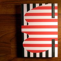

Paul Rand: Modernist Design
Franc Nunoo-Quarcoo
ISBN : 1890761036


(ห้องทำงานของคุณปู่พอล แลนด์--เขตปลอดคอมพิวเตอร์ ^_^)


We know Paul Rand through the stunning advertising, editorial, publishing, institutional, identity, corporate and intellectual legacy he left behind. A major figure at the epicenter of 20th-century design, his impact on modern communication practice and theory was unparalleled. For him, modernism was a way of life and a form of belief, not a style. Like his European colleagues, he understood modernism’s tenets as a something that could be employed to better human experience in the modern world. Whether he was designing for the American Broadcasting Company, IBM Corporation or United Parcel Service, or teaching at Cooper Union or Pratt Institute, Rand gave life to his art, definition to graphic design and a reputation for quality to a discipline that needed it. His was an early voice in proposing the essence of modernist theories in visual communication, and he was both ruthlessly pragmatic and startlingly visionary. His passion for his subject and his understanding of the theories and realities of perception and communication were immense, and he was often able to illuminate for the layperson the complexities and accomplishments of his triumphant art.~Rand’s contemporaries, students and friends knew him as a man even more extraordinarily cultivated and diverse in his talents and interests—here their diversity of voices combine to give a vivid, personal and uniquely informative introduction to Rand and his achievements. A compendium of essays, interviews, photographic reproductions, a contextual timeline and an extensive bibliography, Paul Rand: Modernist Design adds to the growing literature on Rand, helping to place him in the proper context within a century of innovative art, design, architecture and technology.

Texts by Derek Birdsall, Ivan Chermayeff, Shigeo Fukuda, Milton Glaser, Diane Gromeala, Jessica Helfand, Steven Heller, Armin Hoffmann, Takenobu Igharashi, John Meada, Richard Sapper, Wolfgang Weingart and Massimo Vignelli.

+:+:+:+:+:+:+:+:+:+:+:+:+:+:+:+:+:+:+:+:+:+:+:+:+:+:+:+:++:+:+:+:+:+:+
Book bought:
-
Book read:
-Paul Rand: Modernist Design--Franc Nunoo-Quarcoo