Showing posts with label Graphic Design. Show all posts

Sunday, February 24, 2008

Thai PBS Logo

o2008-02-24


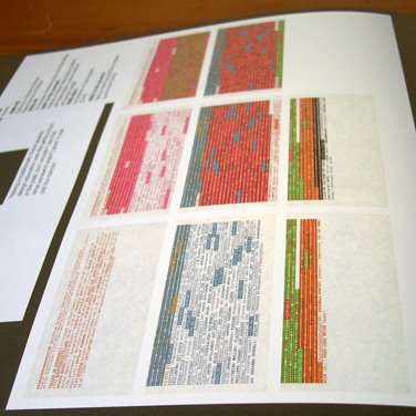
ภาพรวมของทั้งสองเพลต


ส่งประกวด Thai PBS Logo กับเขาด้วยเหมือนกัน เพราะเห็นว่าน่าสนุกดี ^_^

สถานีโทรทัศนี้มีปรัชญาน่าสนใจดีนะ โอมเพี้ยง! ของให้ทำได้จริงๆ อย่างที่พูดที่คิดด้วย เถ๊อะ
และนี่คือหนึ่งในผลงาน 800 กว่าชิ้น(ข้อมูลนี้ดูจากทีวีเอานะ)ที่เข้าร่วมประกวดกันในครั้งนี้
แน่นอนงานด้านล่างเป็นงานของเราเอง เฮอๆ ^_^


เพลตแผ่นที่ 1


เพลตแผ่นที่ 2


โจทย์ที่ผู้จัดประกวดกำหนดให้ก็ คือ

-การออกแบบต้องการอัตลักษณ์ที่สะท้อนถึงหลักการและแนวคิดพื้นฐานของสถานีโทรทัศน์สาธารณะ ในฐานะที่เป็นพื้นที่กลาง ซึ่งมีความเป็นอิสระ ความหลากหลาย ความคิดสร้างสรรค์ และความเป็นธรรม มีรูปแบบที่ร่วมสมัย

-มีเอกลักษณ์โดดเด่นและไม่ล้าสมัยมาก ใช้ได้หลายโอกาส สามารถนำไปประยุกต์ใช้กับสื่อได้หลายประเภท อาทิเช่น สิ่งพิมพ์ ภาพเคลื่อนไหว ฯลฯ

-ต้องการให้มีคำว่า "ไทย" เป็นองค์ประกอบหลักของสัญลักษณ์ และมีอักษรภาษาอังกฤษว่า "Thai PBS" กำกับ โดยมุ่งหวังให้สาธาณชนรับรู้ จดจำ ติดตา และเรียกชื่อช่องติดปากว่า ช่อง "ไทย pbs" หรือ ช่อง "ไทย"


ส่วนไอเดียของเราก็คือ

-อยากให้ตัวโลโก้มันมันดูไม่จริงจัง formal จนเกินไป และมีกลิ่นลูกทุ่งนิดๆ (ได้อารมณ์ท้องถิ่นๆ หน่อยๆ)
-อยากให้โลโก้มันมีความเป็นภาพและมีความเป็นตัวอักษรในเวลาเดียวกัน

ภาพที่เราเลือกนำมาใช้สื่อสารคือ "ภาพมือ" ถึงตรงนี้อาจจะสงสัยกันว่าทำไมต้องเป็น "มือ"?

ในภาษาไทยคำว่า "มือ" มีนัยยะที่หมายถึง "การปฏิบัติ" เช่น "ลงมือ" "มีฝีมือ" "ทำมือ"--สิ่งของที่ทำจากมือมักมีมิติของความเป็นมนุษย์สะท้อนอัตลักษณ์ของผู้ทำ และเชื่อมโยงกับวิถีชีวิตและบริบทของท้องถิ่นนั้นๆ

ในบางแง่มุม "มือ" ในภาษาไทยอาจจะหมายถึง การปฏิสัมพันธ์กันระหว่างคนในชุมชน เช่น "ความร่วมมือ" "ร่วมมือร่วมใจ" (Collective, Co-operative)

เราก็เลยใช้มือที่กำลังสื่อสารเป็นภาษา(ภาษามือก็คือการสื่อสารผ่านมือ) ซึ่งในที่นี้ก็คือ ตัวอักษร "I" ซึ่งก็คือตัวย่อของ คำว่า "Independent" ซึ่งหมายถึง มือที่สามารถสื่อสารและแสดงออกทางความคิดได้อย่างอิสระ นั่นเอง แค่นี้แหละ ^_^

----------------------------------------------------------------------------------------------------------------------------------------------------

ปล--วันที่เขียนอยู่เขาประกาศผู้เข้ารอบ 5 ทีมสุดท้ายแล้ว (ซึ่งวันนี้ห้าทีมสุดท้ายจะต้องอธิบายผลงานต่อหน้าคณะกรรมการ แล้วก็จะตัดสินว่าใครได้รางวัลชนะเลิศอีกที)

นี่คือรายชื่อของ 5 ทีมที่ผ่านการคัดเลือกเพื่อตัดสินในรอบสุดท้าย (ลองดูนะว่ามีชื่อของคนที่คุณรู้จักหรือเปล่า? ^_^ )

1. ชื่อกลุ่ม KITWIN
: นายอาวิน อินทรังษี
: นายกิตติพงษ์ มณีเลิศ

2. ชื่อกลุ่ม GRAFIQ KICKAZZ
: นายกมล บุญญารัชต์
: นายสุริยา รัตนวงศ์กุล

3. ชื่อกลุ่ม สัตตบงกช
: นายณศรัณย์ หวังศรีโรจน์
: นางสาวนันทิยา หวังศรีโรจน์
: นายชุมพล มียิ่ง
: นางสาวพฤกษา มียิ่ง

4. ชื่อกลุ่ม YOU LOOK SAD ON THE DANCE FLOOR
: นายธีร์ โตชยานนท์
: นายศุภรัตน์ เทพรัตน์

5. ชื่อกลุ่ม COOKIESDYNAMO LTD.

ติดตามผลงานการประกวดได้ทางหน้าจอไทยพีบีเอส และ www.thaipbs.or.th

Tuesday, March 20, 2007

Visuwords™

Online Graphical Dictionary
2007-03-20


http://www.visuwords.com/


Visuwords™-Online Graphical Dictionary is a visual thesaurus that looks up words to find their meanings and associations with other words and concepts. It produces an interactive graph where one can easily perceive the different word associations, as well as click the nodes and continuously expand the graph.

Visuwords uses Princeton University's WordNet, an opensource database built by University students and language researchers. Combined with a visualization tool and user interface built from a combination of modern web technologies, Visuwords is available as a free resource to all patrons of the web.

+:+:+:+:+:+:+:+:+:+:+:+:+:+:+:+:+:+:+:+:+:+:+:+:+:+:+:+:+:+:+:+:+:+
Book bought:
-
Book read:
-In the Bubble : Designing in a complex world--John Thackara

Saturday, March 10, 2007

1ทีม+1ทีม=1ทีม

2007-03-10

บริษัทที่ผมทำงานอยู่ เป็นกลุ่มบริษัทที่มีบริษัทในเครืออยู่ 5 บริษัท
สามบริษัทเป็นบริษัทที่เกี่ยวข้องกับงานวิศวกรรม และบริหารงานก่อสร้าง-ซึ่งไม่มีทีมฟุตบอล (ซีเรียสๆ)
ส่วนสองบริษัท เป็นบริษัท ออกแบบสถาปัตยกรรม(ผมทำงานอยู่บริษัทนี้) และบริษัทรับออกแบบตกแต่งภายใน-มีทีมฟุตบอลเป็นของตัวเอง (ซึ่งก็ไม่ได้เก่งกาจอะไรเน้นสนุกกับความตลกโปกฮา เน้นนันทนาการ) ^_^

ทีมของบริษัทผมกับทีมของอินทีเรียแข่งฟุตบอลกันบ่อยๆ ตามโอกาส(ไม่ถึงกับเรียกได้ว่าเป็นประเพณี--แข่งกันเอาตามสะดวกและความสนุก ตามโอกาสว่างที่พอจะหาได้)
ผมเองก็มีโอกาสได้ไปเล่นฟุตบอลกระชับมิตรกับเขาสักครั้งสองครั้งได้มั้ง-ไม่บ่อย :P

เมื่อต้นอาทิตย์รุ่นน้องคนนึง ซึ่งเป็นคนประสานงานเกี่ยวกับกิจกรรมฟุตบอลของบริษัท
เข้ามาบอกผมว่า อยากได้โลโก้ทีมฟุตบอลใหม่ ซึ่งเป็นโลโก้ใหม่ที่รวมทีมฟุตบอลทั้งสองทีม(สถาปัตย์ กับ อินทีเรีย)ไว้ด้วยกัน
เอาไว้ใช้แข่งในแมทช์ใหญ่ที่ไปในนามของบริษัท (โอ้ว-เป็นเรื่องเป็นราวเลยนะ เรื่องแบบนี้แหละที่เราจริงจังและถนัด เรื่องไร้สาระน่ะ ^_^)
ผมรีบรับปากเพราะเป็นคนมีวิสัยทัศน์ดีในเรื่องแบบนี้ เพราะเห็นว่าเรื่องนี้มีศักยภาพทีจะพัฒนามันให้กลายเป็นเรื่องสนุกสนาน และบันเทิงเริงรมย์ได้

ขณะที่ผมออกแบบโลโก้ใหม่ อีกฝ่ายหนึ่งก็คัดเลือกแบบเสื้อและสีที่ต้องการ จากนั้นก็ให้ทุกคนในออฟฟิศโหวด ทั้งชายและหญิง(แบบเสื้อต้องถูกใจผู้หญิงด้วย เพราะถึงแม้จะไม่ได้แข่ง แต่เธอก็จะได้เสื้อเอาไว้ใส่เล่นๆ)
จนในที่สุดก็ได้แบบเสื้อมาแบบหนึ่งเป็นเสื้อคอวีสีขาว ตัวเสื้อเป็นเสื้อเรียบๆ ไม่มีลายสีกรมท่า--สวยดี

เรื่องเสื้อเป็นอันจบ-ที่เหลือคือโลโก้ ซึ่งเป็นหน้าที่ผม :P

ไอเดียแรกเลยที่คิดได้ก็คือ
1. น่ามีตัวเลข 103 อยู่ในโลโก้ด้วย
2. น่าจะเป็นรูปสัตว์อะไรสักอย่าง (เห็นพวกทีมฟุตบอลชอบใช้สัตว์เป็นเป็นโลโก้

จากไอเดียนี้ก็ได้แบบอย่างที่เห็น


ทางเลือกที่หนึ่ง


ความคิดเห็นของผม : ผมชอบแบบนี้นะ เพราะมันดูคลุมเคลือดี เหมือนสัตว์หลายๆ อย่าง อารมณ์ที่ออกมาทางสีหน้าก็มีความขัดแย้งในตัวเองสูง ดูหวาดระแวง เนิร์ดๆ นิดๆ ขี้เล่น และดูเหมือนเป็นสัตว์ที่นอนไม่หลับ แล้วก็สอดคล้องกับไอเดียแรกที่คิดได้ เพราะมีตัวเลข 103 แล้วก็มี คำว่า D+IA ซึ่งเป็นชื่อย่อของทั้งสองบริษัท ที่ผมชอบที่สุดก็คือมันดูน่ารัก และไม่จริงจังดี ^_^

ควาคิดเห็นของคนอื่น : มันไม่น่าเกรงขาม ไม่เท่ รุ่นพี่คนนึงยกตัวอย่าง ดูตัวอย่างทีมฟุตบอลที่มีชื่อเสียง หงษ์แดง ปีศาจแดง อินทรีหล็ก หรือแม้ก็ทั้งทีมในเอเชียทีมชาติญี่ปุ่นก็เป็นรูปเหยี่ยว ดิเห็นปะแต่ละทีมมันดูเท่ทั้งนั้น โลโก้นี้มันดูน่ารักและประหลาดจนเกินไป อยากได้แบบเท่ๆ แล้วก็ดูแบดบอยหน่อยๆ-หลายคนออกความเห็นแบบนี้ แต่ไม่ใช่จะไม่ชอบกันทุกคน รุ่นน้องบางคนที่เป็นผู้หญิงก็บอกว่า-ชอบๆ น่ารักๆ ดี

เมื่อเป็นเช่นนี้ก็เลยเกิดแนวทางที่สองขึ้นมา


ทางเลือกที่สอง


ความคิดเห็นของผม : ผมพยายามปรับมันให้ดูแบดบอยขึ้น ให้มันดูแล้วชั่วๆ นิดๆ โดยยังคงไอเดียเรื่องตัวเลข 103 เอาไว้อยู่ จากไม่รู้ว่าเป็นสัตว์อะไร ก็ตอนนี้เริ่มชัดเจนแล้ว-เพราะมันกลายเป็นลิงเผือก(อย่าถามว่าทำไมต้องเป็นลิงเผือกมีความหมายอะไร-เพราะรุ่นพี่ที่ออฟฟิศพยายามถามแล้วคำตอบที่ได้ก็คือ ไม่รู้ ^_^ เฮอๆ) สำหรับตัวผมเองทำเสร็จแล้วก็ไม่ชอบอันนี้เท่าไหร่นัก ชอบแบบแรกมากกว่า :P

ควาคิดเห็นของคนอื่น : อันนี้ไม่ค่อยมีคนโอกับมันเท่าไหร่ มีคนชอบประมาณสองคน-บอกว่าเท่ดี อยากได้อะไที่แบดๆ แบบนี้แหละ แต่ก็มีหลายเสียงเหมือนกันที่บอกว่าแย่กว่าอันแรก ส่วนผู้หญิงไม่มีใครรับอันนี้ได้เลย

ถึงตรงนี้ผมก็เลยลองเปลี่ยนทิศทางในการออกแบบนิดหน่อย
จากเรื่องสัตว์ก็เปลี่ยนเป็นโลโก้ที่เป็นเหมือนสัญลักษณ์เป็นรูปนามธรรม-ก็ได้นิหว่า น่าลองๆ
แต่ก็ยังคงเก็บไอเดียเรื่องต้องมีตัวเลข 103 อยู่บนโลโก้


ทางเลือกที่สาม


ความคิดเห็นของผม : อันนี้ผมใช้รูปทรงที่เป็นเลขาคณิตมาลองจัดองค์ประกอบ รูปนี้เกิดจากตัวเลข 103 ที่สามารถอ่านได้ทุกทิศทาง พอทำเสร็จแล้วอันนี้ผมก็ชอบนะ ไม่เลวๆ (ผมคิด)

ควาคิดเห็นของคนอื่น : เสียงส่วนใหญ่ลงความเห็นว่าดีกว่าสองอันแรก มันควรจะมาในทิศทางนี่แหละ แต่อยากให้พัฒนาต่อให้อยู่ในแนวทางนี้


เป็นอันจบกระบวนการในการทำงานออกแบบโลโก้ของเรา-ที่เหลือก็ต้องดูกันต่อไปว่าทีมบริษัทอินทิเรียเขาจะโอหรือเปล่า ^_^


ปล--อันนี้เป็นโลโก้ทีมฟุตบอลของบริษัทเรา ที่เราเคยทำให้ เพื่อนและพี่หลายคนแซวว่า
ตั้งแต่ใช้โลโก้นี้มาแข่งยังไม่เคยชนะใครเลยว่ะ :P เพราะโลโก้มันคิขุไป เหมือนโลโก้ทีมบอลของโรงเรียนอนุบาลที่ไหนสักแห่ง แล้วก็หัวเราะกัน (เราว่าไม่เกี่ยวกับโลโก้มั้ง ^_^)
http://wichiter.blogspot.com/2006/11/football-club.html
+:+:+:+:+:+:+:+:+:+:+:+:+:+:+:+:+:+:+:+:+:+:+:+:+:+:+:+:+:+:+:+:+:+


ปล2--ลองเอาโลโก้ที่ทำไว้มาพัฒนาต่อเป็นลายผ้าดูก็โอเคนะ ทำเป็นผ้าปูโตีะ หรือผ้าม่านคิดว่าน่าจะดูสวยดี เหมือนกัน ^_^

+:+:+:+:+:+:+:+:+:+:+:+:+:+:+:+:+:+:+:+:+:+:+:+:+:+:+:+:+:+:+:+:+:+
Books bought:
-In the Bubble : Designing in a complex world--John Thackara
-The Atlas of Experience--Louise Van Swaaij and Jean Klare

Book read:
-นิตยสารสารคดี-เล่มที่ 264--กุมภาพันธ์ 2550

Sunday, October 15, 2006

Grid

2006-10-15


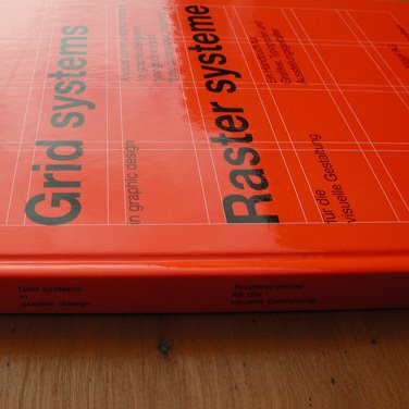
Grid Systems in Graphic Design
Josef Müller-Brockmann
ISBN: 3721201450


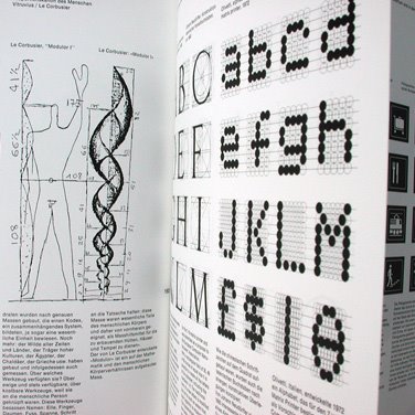
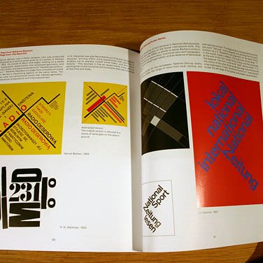
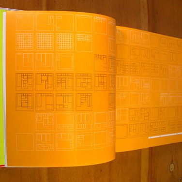
A Visual Communication Manual for graphic designers, typographers and three dimensional designers. Considered by most to be the definitive book on grid systems. This book is a must for any designer. From concept to instructional, this book covers typography through grid systems used in design both 2D and 3D.

Put simply: a guidebook from the profession for the profession. The development of organizational systems in visual communication was the service and the accomplishment of the representatives of simple and functional typography and graphic design.


Grid Systems
Kimberly Elam
ISBN: 1568984650


Although grid systems are the foundation for almost all typographic design, they are often associated with rigid, formulaic solutions. However, the belief that all great design is nonetheless based on grid systems (even if only subverted ones) suggests that few designers truly understand the complexities and potential riches of grid composition.

In her book Geometry of Design, Elam shows how proportion, symmetry, and other geometrical systems underlie many of the visual relationships that make for good design. Now, Elam brings the same keen eye and clear explanations to bear on the most prevalent, and maybe least understood, system of visual organization: the grid.

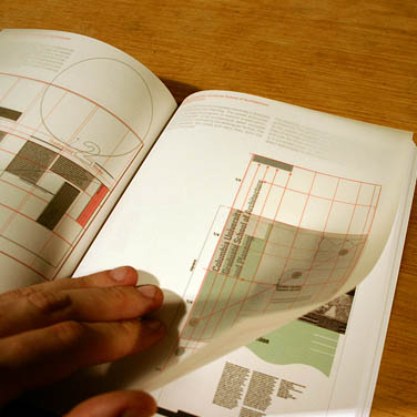
Filled with extensive research and more than 100 informative examples from the Bauhaus to Nike ads, Grid Systems provides a rich, easy-to-understand overview and demonstrates a step-by-step approach to typographic composition. It suggests design strategies that transcend simple function and reductionist recipes to allow grids to become a means of truly dynamic communication. Any designer, educator, or student will benefit greatly from this elegant slim book, chock-a-block full of colorful examples, helpful vellum overlays, and Elam's insightful analysis.


The Designer and the Grid
Julia Thrift, Lucien E. Roberts
ISBN : 2-88046-814-0


"There has been a serious lack of design titles for students that explain the basic principles of design... what this book is trying to do is good... (It) is a must-have for all design students. I've seen nothing else in the market that would compete with this title."
Graphics International

"Here is one of those special items: a new book on typography (or at least with a high typographic content), which should be added to the list of required reading for all professionals and students alike... The Designer and the Gri really delves behind its subject, and beyond it, as promised. We can gain a clear insight into the importance of grids, and to the relevance of 'grid philosophy' to the life issues posed at the beginning of the book: the need to find some order in the chaos of our world; the need for a clearer life framework. Even from the narrower typographic standpoint, this book is a must."
Baseline

This book reveals the key to the hidden driving force behind almost all graphic design - the grid. Case studies and interviews with leading designers such as Simon Esterson, Vaughan Oliver, Ellen Lupton, and Muller & Hesse explore what the grid means today and these and other top names choose their favourite grids. The authors move on to take a step-by-step look at the precision of the digital grid and ask, provocatively, whether the new CAD/CAM technologies may spell the end of the grid as we know it.

About The Author

Lucienne Roberts' design studio, sans+baum, specialises on projects outside the purely commercial. Clients have included the ICA, Sadler’s Wells, Breakthrough Breast Cancer, The British Council, Phaidon Press and the identity for the Arts Council’s Architecture Week. Lucienne also teaches at the London College of Printing.

Julia Thrift is a well-established design and architecture journalist who contributes to many magazine and book publications, including Blueprint magazine. She is also Head of Programmes at the Civic Trust in London.

+:+:+:+:+:+:+:+:+:+:+:+:+:+:+:+:+:+:+:+:+:+:+:+:+:+:+:+:++:+:+:+:+:+:+
Book bought:
-
Books read:
-Grid Systems in Graphic Design--Josef Müller-Brockmann
-Grid Systems--Kimberly Elam
-The Designer and the Grid--Julia Thrift and Lucien E. Roberts

Saturday, October 14, 2006

Uncommon Places

2006-10-14


+:+:+:+:+:+:+:+:+:+:+:+:+:+:+:+:+:+:+:+:+:+:+:+:+:+:+:+:++:+:+:+:+:+:+
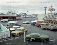

Uncommon Places
Stephen Shore
ISBN: 1931788340


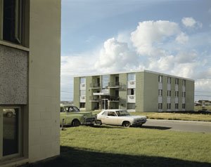
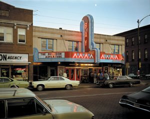
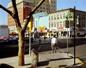
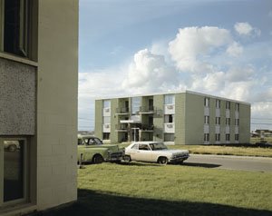
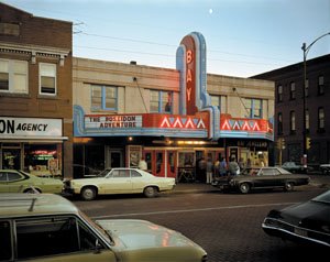
Published by Aperture in 1982 and long unavailable, Stephen Shore’s legendary Uncommon Places has influenced a generation of photographers. Among the first artists to take color beyond advertising and fashion photography, Shore’s large-format color work on the American vernacular landscape stands at the root of what has become a vital photographic tradition. Uncommon Places: The Complete Works presents a definitive collection of the original series, much of it never before published or exhibited.

Like Robert Frank and Walker Evans before him, Shore discovered a hitherto unarticulated version of America via highway and camera. Approaching his subjects with cool objectivity, Shore’s images retain precise internal systems of gestures in composition and light through which the objects before his lens assume both an archetypal aura and an ambiguously personal importance. In contrast to Shore’s signature landscapes with which “Un-common Places” is often associated, this expanded survey reveals equally remarkable collections of interiors and portraits.

As a new generation of artists expands on the projects of the New Topographic and New Color photographers of the seventies—Thomas Struth (whose first book was titled Unconscious Places), Andreas Gursky, and Catherine Opie among them—Uncommon Places: The Complete Works provides a timely opportunity to reexamine the diverse implications of Shore’s project and offers a fundamental primer for the last thirty years of large-format color photography.

At age twelve, Stephen Shore’s work was purchased by Edward Steichen for the Museum of Modern Art. At twenty-four, he became the first living photographer to have a one-man show at the Metropolitan Museum of Art, New York. Other one-man show venues include the Museum of Modern Art, New York, the Art Institute of Chicago, and the Kunsthalle Düsseldorf. He has received two National Endowment for the Arts Grants and a Guggenheim Foundation Grant, and has been the Chair of Bard College’s photography department in upstate N.Y. since 1982.



FARMAX : Excursions on Density
MVRDV
edited Winy Maas, Jacob van Rijs, Richard Koek
ISBN 978 90 6450 587 4

Vast areas of the Netherlands and other states seem to be filling up with a suburban 'matter' of low cost housing, low rent offices, warehouses and other low density elements. How are we to cope with this matter that is turning our environments into one 'sea of mediocrity', one vast 'greyness', an equation of difference and individualism? Is it possible to reconsider this situation by carrying density to extremes and ruffling the texture with inserts or polarities? This book examines the possibilities of these extremes. It sets out to discover the prospects and limitations, the world of the extreme Floor Area Ratio, FARMAX. Conceived and edited by Winy Maas and Jacob van Rijs with Richard Koek and produced by MVRDV, FARMAX reads as an architectural narrative composed of studies and designs made by MVRDV and students from Delft University of Technology, the Berlage Institute and the Rotterdam Academy of Architecture and Urban Planning, along with contributions by other authors.



From Lascaux to Brooklyn
Paul Rand
ISBN: 0300066767

One of the world's leading graphic designers, Paul Rand has had a profound influence on the design profession: his pioneering work in the field of advertising design and typography has helped elevate "commercial art" to one of the fine arts. In this lively and visually arresting book, Rand awakens readers to the lessons of the cave paintings of Lascaux—that art is an intuitive, autonomous, and timeless activity—and he shows how this is conveyed in works of art from the Leaning Tower of Pisa to a painting by Cézanne, African sculpture, a Gorgan pitcher, and a park in Brooklyn, all of which are aesthetically pleasing no matter what their era, place, purpose, style, or genre. Rand defines aesthetics and the aesthetic experience, in particular as it affects the designer, and he helps members of his profession articulate and solve design problems by linking principles of aesthetics to the practice of design.

Illustrating his ideas with examples of his own stunning graphic work, as well as an eclectic collection of masterpieces, Rand discusses such topics as: the relation between art and business; the presentation of design ideas and sketches to prospective clients; the debate over typographic style; and the aesthetics of combinatorial geometry as applied to the grid. His book will engage and enlighten anyone interested in the practice or theory of graphic design.


Paul Rand's vast experience has included art direction for both magazines and advertising agencies, packaging, book illustration, and typography, as well as painting and art education. Among the numerous clients for whom he has been a consultant and/or designer are the American Broadcasting Company, Cummins Engine Company, IBM Corporation, United Parcel Service, and Westinghouse Electric Corporation. He has taught at Pratt Institute and Cooper Union and is now professor emeritus at Yale University. During his lifetime he has been honored with prestigious awards from many professional and academic groups, and in 1987 he was the first recipient of the Florence Prize for Visual Communication. His work is in the permanent collections of museums in the United States, Europe, and Japan. He is the author of many books, the most recent of which are Design, Form, and Chaos and Paul Rand: A Designer's Art, both published by Yale University Press.


+:+:+:+:+:+:+:+:+:+:+:+:+:+:+:+:+:+:+:+:+:+:+:+:+:+:+:+:++:+:+:+:+:+:+
Books bought:
-FARMAX : Excursions on Density--MVRDV
-From Lascaux to Brooklyn--Paul Rand

Books read:
-A+U Magazine 06:09 number432--September 2006
-Uncommon Places--Stephen Shore
-FARMAX : Excursions on Density--MVRDV